The pictures worth a thousand words…
19/06/18 07:58 Filed in: Infographics
…and a few stats too!
Graphic visualisation of statistics, organisations and almost anything you can think of is very much in vogue at the moment.
At CanalPath Creative, we pride ourselves on the clarity and usefulness of the many infographics we produce for both ourselves and customers.
Graphic visualisation of statistics, organisations and almost anything you can think of is very much in vogue at the moment. It is easy to understand why when you see how effective a good infographic can be. Some time ago I transformed a dull 64 page document into a double sided A4 graphically illustrated solution which folded down to credit card size. This enabled the organisation’s staff to quickly understand the process which normally would have taken a lot of reading and be able to carry it around in their pockets.
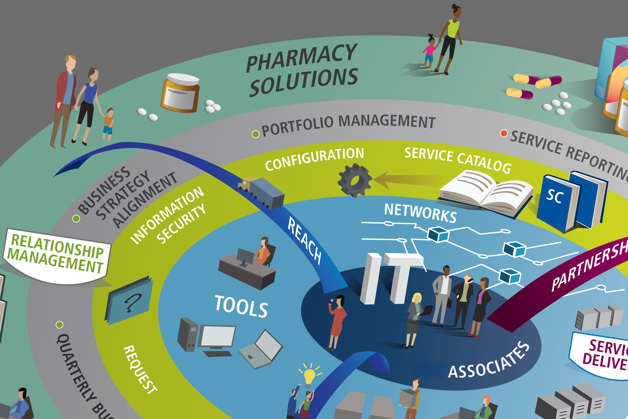
One thing however is becoming more obvious is the use of (info)graphics simply for the sake of using graphics and in many cases the result appears to be more confusing than simply showing the data. We now see incomprehensible pages either littered with a variety of images drowning in a sea of data or huge ‘maps of the cosmos’ with minuscule labels. The term ‘map shock’ could soon be replaced by ‘infographic electrocution’! Certainly the idea that these graphics present complex information quickly and clearly has clearly been missed by many ‘(info)graphic artists’.
A (rather tongue in cheek) blog post showed graphically illustrated statistics that an article with a nice infographic is much more likely to be forwarded/tweeted or retweeted than a text heavy version! Should really have added some here then…
Graphic visualisation of statistics, organisations and almost anything you can think of is very much in vogue at the moment. It is easy to understand why when you see how effective a good infographic can be. Some time ago I transformed a dull 64 page document into a double sided A4 graphically illustrated solution which folded down to credit card size. This enabled the organisation’s staff to quickly understand the process which normally would have taken a lot of reading and be able to carry it around in their pockets.
One thing however is becoming more obvious is the use of (info)graphics simply for the sake of using graphics and in many cases the result appears to be more confusing than simply showing the data. We now see incomprehensible pages either littered with a variety of images drowning in a sea of data or huge ‘maps of the cosmos’ with minuscule labels. The term ‘map shock’ could soon be replaced by ‘infographic electrocution’! Certainly the idea that these graphics present complex information quickly and clearly has clearly been missed by many ‘(info)graphic artists’.
A (rather tongue in cheek) blog post showed graphically illustrated statistics that an article with a nice infographic is much more likely to be forwarded/tweeted or retweeted than a text heavy version! Should really have added some here then…