The future of the Pantone colour system
07/06/23 17:49 Filed in: Design
The future of the Pantone colour system…
In 2019, Adobe announced the future removal of support for Pantone colours from the Creative Cloud tools. This decision sparked a lot of debate among designers and industry professionals about the importance of Pantone colours and their place in the design world.
So, what are Pantone colours?
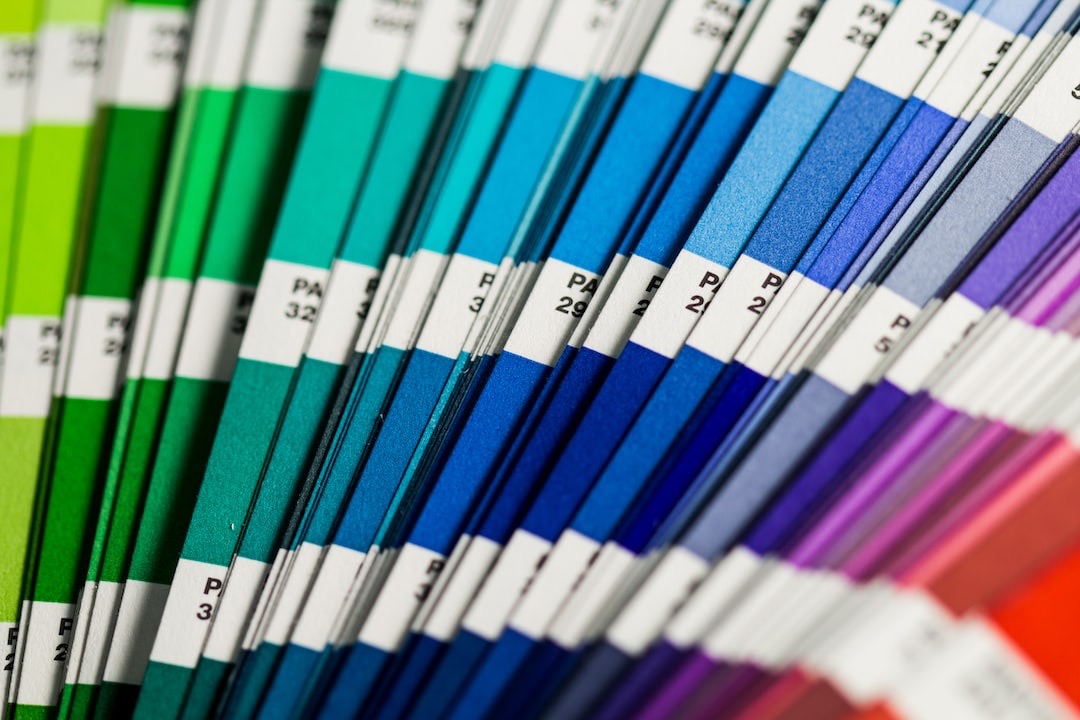
The Pantone Matching System (PMS) is a standardised colour system used in the design and print industries. They are a set of colour swatches, which have been added to regularly, that have been assigned a unique number or name. Pantone colours are used to ensure consistency and accuracy in colour reproduction across various media and materials, including print and to some extent digital use. They are widely recognised and used by designers, printers, and manufacturers globally as part of a company’s branding system to ensure consistency no matter who is producing branded output.
Careful users will have their swatch books kept as far away from light, especially sunlight, to make sure the ‘chip’ (the tear-off colour samples to work with) colour lasts as long as possible, replacing pages when a colour has been used is one thing, replacing the entire book is not cheap!
Why did Adobe remove Pantone support?
Adobe’s decision to remove support for Pantone colours was based on a number of factors. One of the primary reasons given was the growing popularity of digital design and the move towards RGB and Hex colour systems. Pantone colours are used for print design, which has become less prominent in recent years due to the rise of digital media. Additionally, Adobe cited the complexity and cost of maintaining Pantone libraries as a reason for their removal, mainly through licensing fees to Pantone.
What does this mean for designers?
The removal of Pantone support from Adobe has significant implications for designers. Pantone colours are extensively used in print and their removal from Adobe’s Creative Cloud applications means that designers will need to find alternative solutions for incorporating Pantone colours into their designs to maintain consistency. This could include subscribing to Pantone Connect, manually inputting the colour values, using a third-party plugin, or even using another design application such as those from Affinity Serif.
However, some designers argue that the removal of Pantone support from Adobe is a positive development. They argue that it will encourage designers to experiment with new colour systems and push the boundaries of design. It may also encourage designers to think more critically about their colour choices and consider how they will appear across different media and materials. There has already been the Freetone* swatch library freely distributed which is ‘remarkably similar’ to the Pantone library.
What are the alternatives to Pantone colours?
There are several options that designers have. One popular alternative is the CMYK colour system, which is used for print design and saves costs by avoiding the use of spot colours. The downside of this can be when trying to match critical brand colours on a variety of materials. Pantone Connect is the service and Adobe extension which can give users access to PMS colours again but at an additional cost on top of the monthly Creative Cloud subscription.
In conclusion, the removal of Pantone support from Adobe’s Creative Cloud applications has sparked a lot of debate among designers and industry professionals. It will be a nuisance for both designers and printers and the company most likely to suffer is Pantone if it loses significant sales of specifier swatch books and more importantly, ink.
*https://culturehustle.com/products/freetone